PinnedConnor RothschildinTowards Data ScienceColor in Data Visualization: Less How, More WhyToo often, we use color as a tool to make pretty pictures, when it should be used to inform our audiences.·9 min read·Jan 16, 2020----
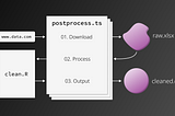
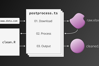
Connor RothschildinTowards Data ScienceIncluding R in your Flat Data Workflow·5 min read·Jun 4, 2021----
Connor RothschildinTowards Data ScienceHow to Combine Animated Plots in RLeveraging the power of gganimate and magick to combine animated plots for your viewers.·4 min read·Jan 21, 2021--2--2
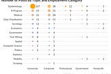
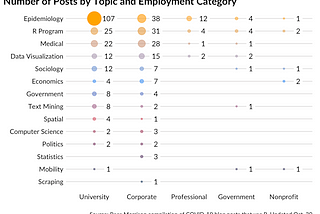
Connor RothschildinTowards Data ScienceCOVID-19 Posts: A Public Dataset Containing 400+ COVID-19 Blog PostsMaking hundreds of COVID-19 blog posts from the R community available for public use.·5 min read·Oct 31, 2020----
Connor RothschildinTowards Data ScienceAdd Animations to your Hugo Academic Site, EasilyThree simple steps to bring impressive animations to your Academic homepage, using blogdown and CSS.·12 min read·Aug 21, 2020----
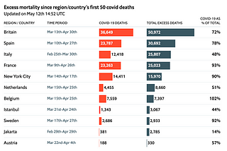
Connor RothschildinTowards Data ScienceRecreate Publication-Quality, Interactive Tables in R using reactableReplicating a table by the Economist, exclusively in R·13 min read·Jun 15, 2020--1--1
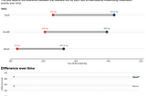
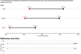
Connor RothschildinTowards Data ScienceCreate Dumbbell Plots to Visualize Group Differences in RUse {ggalt} to create a dumbbell plot, a beautiful and powerful alternative to clustered bar charts.·7 min read·Mar 15, 2020--2--2
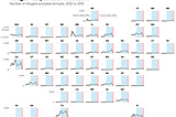
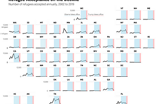
Connor RothschildinTowards Data ScienceHow to Make Beautiful Small Multiple US Maps in RA single line of code can take your visualization to the next level·5 min read·Feb 2, 2020----
Connor RothschildinAnalytics VidhyaHow (and Why) to Add a Chart to Your D3.js TooltipI think tooltips are one of the most underrated parts of a visualization. When users are initially confused by a visualization, they often…6 min read·Jan 5, 2020----